updated 2025-01-14 16:00
High DPI Pictures
As computer screens have increased in "pixel density," older web sites look fuzzy and out of date. In order to fix this you have to
- go back to your original photos and save them as bigger JPEG files.
- change your HTML code to reference the new files properly.
Layout measurements in HTML assume that there are 96 CSS pixels per inch.
... HTML pages specify layout using Cascading Style Sheets (CSS). Look it up.
Some modern laptops have higher resolution displays: for example, an Apple MacBook Pro with "Retina" screen has about 220 device pixels per inch. iPhones have 326 to 485 device pixels per inch; some smartphones go higher.

1x image
Standard advice for coding HTML is to always specify WIDTH and HEIGHT (in CSS pixels) on an IMG tag, so that page layout does not need to wait for the image to be read in to determine its size. For example:
file: thumb-t1.jpg" width="75" height="75"
HTML: <img src="htmx/thumb-t1.jpg" width="75" height="75">
if WIDTH and HEIGHT are specified in an IMG tag, and the actual pixel dimensions of an image are different, a visitor's web browser will stretch or shrink the image to fit into the specified size. Stretching a picture to fill a bigger space will always look fuzzy. When modern browsers must stretch or shrink an image, they use information about your screen's actual resolution. If you provide a picture stored at 96 DPI and the browser wants to display it on a 220 DPI screen, the browser has to interpolate about 4 pixels for every one in your image -- and this will make the picture look unsharp.
To make an image look sharper on displays with higher pixel densities
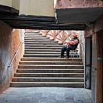
2x image
Specify WIDTH and HEIGHT in the IMG tag for the image in CSS pixels, and then save the image at a larger size, with width and height twice (or more) the IMG tag's pixel size. When your page is viewed on a high resolution screen, a modern browser will shrink or stretch the image to fit in the specified space... and it will use the "extra" pixels if the screen can display them, or discard image pixels if the screen doesn't need them. (In the example to the right, I saved the picture as 150x150 pixels, and displayed it in a 75x75 CSS space. If you are viewing this page on a high-resolution screen, the thumbnail on the right should look sharper than the one above.)
file: thumb-t1-2x.jpg" width="150" height="150"
HTML: <img src="htmx/thumb-t1-2x.jpg" width="75" height="75">
This HTML sends the "-2x" image with 4 times the number of CSS pixels: on a low-density device, the browser discards 75% of the pixels; on a high-density device, the browser uses all the pixels.
For a small file like a thumbnail, sending extra pixels won't make a noticeable difference in speed. For big images, sending extra pixels might take longer. There is a way to avoid sending pixels that would just be discarded: see below.
Is it worth creating -3x or -4x versions of the image? On a very high DPI screen, the image will look even sharper, and this effect might be desirable, especially if you are displaying fine art. The tradeoff is that the bigger images take longer to transmit from the web server: a -3x has 9 times the pixels, and a -4x has 16x. Users who connect over a slow connection will see the images taking longer to load. For now I am sticking to -1x and -2x versions of pictures.
Responsive Images
'Responsive Images' is a recent HTML design practice: you create web pages so that they make the best use of users' displays, by creating multiple versions of graphic files, and telling the user's browser to choose which version to fetch, depending on what the display can show.
Features in HTML5 allow you to specify which version of a file to load, depending on the monitor's pixel density and size. Using responsive images requires that your HTML IMG tags be rewritten to
- provide URLs for multiple versions of each graphic
- add rules to specifying which version to display depending on your monitor
For example, this IMG tag chooses which file to display depending on the display density:
<img src="thumb-t1.jpg" width="75" height="75" srcset="thumb-t1.jpg 1x, thumb-t1-2x.jpg 2x">
A conforming web browser will fetch and display the "-2x" version of the image if displaying to a screen with density 2x or above, i.e. 192 device pixels per inch or more.
Old browsers that don't understand SRCSET= ignore it and use the SRC= attribute. For newer browsers, SRCSET= overrides SRC= and directs the browser to request the regular or the -2x file depending on which one will look best. Sending a smaller file, when the big one won't make the viewed image any better, can speed up site loading.
The features for responsive design can handle a lot of cases. SRCSET can be used in several other ways besides the one described above to select which images are used in an IMG tag. Look it up.
Generating the HTML for High DPI photos using expandfile Macros
When I am preparing photos for web display, I sharpen, enhance, and crop them. Then I save the photo twice, for example rabbit.jpg and rabbit-2x.jpg, with the second one twice as wide and twice as high. I generate .html files for my sites using my tool expandfile: it reads source files and creates .html files. In the source file, I invoke macros that are expanded into HTML IMG tags as described above. The macros automatically get the image size from the image file, and if a -2x image file is also present, generates IMG tags with the SRCSET attribute as described above.
As I modify my pages, I have to do a little extra work to save the -2x file version of each picture. Once this is done, the actual creation of IMG tags is easier and less error prone, and the resulting page will display more crisply. For example, see the expandfile documentation on getimgdiv which describes an image macro and its usage.
Responsive Design
'Responsive Design' is a related recent HTML design practice: it suggests designing web pages so that they display different features or arrange features differently depending on the size of the window (in CSS pixels). In your CSS, you write "media queries" that instruct the visitor's browser to select different CSS statements depending on the current display's abilities.
For example, a full size display might show a menu bar with drop-downs, while the same page, on a small device, could have a simpler menu, or one that is only displayed when a 'menu' icon is clicked. The following CSS example changes the way a page displays when the display window is less than 600 CSS pixels wide. The example turns off the "redmenubar" display element and turns on the "altmenubar" for small windows, and also adjusts margins:
  <style>
    .altmenubar {display: none;}
    @media (max-width: 600px) {
      .redmenubar {display: none;}
      .altmenubar {display: block; margin: 9px 5px 0 5px;}
      .main {margin-top: 0; padding: 5px 5px 5px 5px;}
    }
  </style>
This is just a taste of what you can do with the new features. RTFM.
PS
Run the W3C Validator on your pages to make sure your HTML conforms to standards.